Tostitos

If you look at the center of this logo, you can see two people enjoying a Tostito chip with a bowl of salsa. This logo conveys an idea of people connecting with each other.
Formula 1

At first, this logo might not make much sense. But if you look closely, you’ll see the number 1 in the negative space between the F and the red stripes. I also love how this logo communicates a feeling of speed.
Milwaukee Brewers

The Milwaukee Brewers is a professional baseball team from Milwaukee , Wisconsin (well, duh). Their logo is actually made up of the letters M (on top) and B (below the m). These two letters also form a baseball glove.
Northwest Airlines

This simple looking logo actually carries a lot of information. First of all you can see the letters N and W, the first two letters of the brand name. But what most people don’t see is the compass that points to the Northwest, another reference to the brand name.
Amazon

This logo doesn’t seem to hide much at first sight, but it gives you a little insight in the philosophy behind the brand. First of all, the yellow swoosh looks like a smile: Amazon wants to have the best customer satisfaction. The swoosh also connects the letters a and z, meaning that this store has everything from a to z.
Toblerone

Toblerone is a chocolate-company from Bern , Switzerland . Bern is sometimes called The City Of Bears . They have incorporated this idea in the Toblerone logo, because if you look closely, you’ll see the silhouette of a bear.
Baskin Robins

The old logo of Baskin Robbins had the number 31 with an arc above it. The new logo took this idea to the next level. The pink parts of the BR still form the number 31, a reference to the 31 flavors.
Sony Vaio

Sony Vaio is a well known brand of laptops. But did you know that the name Vaio logo also had a hidden meaning? Well, the first two letters represent the basic analogue signal. The last two letters look like a 1 and 0, representing the digital signal.
Eight

I really love this logo: every letter is made of the number 8.
Carrefour

Carrefour is one of the biggest European retailers, and its also French for crossroads. The logo symbolizes this word via two opposite arrows.
They also added the first letter of the name, because if you look closely you’ll see the letter C in the negative space between the two arrows.
Roxy

Roxy is a company that specializes in clothing and accessories for girls who love snowboarding, surfing The company is actually a part of Quiksilver. The Roxy logo is made of two Quiksilver logos that form a heart.
Unilever

Unilever is one of the biggest producers of food, beverages, cleaning agents and personal care products. They produce a huge amount of different products and they wanted to reflect this in their logo. Each part of the logo has a meaning. For example: the heart represents love, care and health – feeling good, a bird is a symbol of freedom. Relief from daily chores getting more out of life.
Hartford Whalers

This logo also uses a negative space to create the letter H. You can see three different parts: the letter H and W and a whales tail in blue.
Elefont

This logo might look like a simple letter, but don’t be fooled: you can see a part of an elephants trunk in the negative space inside the letter e.
Sun Microsystems

The Sun logo is one of the most famous ambigrams in the world. You can read the brand name in every direction; both horizontally and vertically. This logo was designed by professor Vaughan Pratt of the Stanford University .
NBC

The NBC (National Broadcasting Company) is one of the biggest American television networks. I think most of you have already seen the peacock in this logo. The peacock has 6 different tail feathers, referring to the six divisions at the time that this logo was created. The peacocks head is flipped to the right to suggest it was looking forward, not back.
GreenLabs

I know this logo looks like a simple, boring green tree, but if you look at the tree crown, you’ll see that it can also be interpreted as a brain. The logo lays emphasis on the strong intellectual capabilities of the companys staff and also reflects green and labs parts of their name!
Big Ten

Big Ten is an academic union which was founded in the year 1896. Until 1990, this union consisted of 10 universities, but in June 1990 Pennsylvania State University was added. They didn’t want to change their name, so they added the number 11 to the logo.
Eighty-20

Eighty-20 is a small consulting firm. Most people think that the logo has nothing to do with the brand name. But the trick is to view the dark squares as 1′s and the light squares as 0′s. Then the top line reads 1010000 and the bottom line reads 0010100, which represent 80 and 20 in binary.
Fedex

This is probably one of the best known logos with a hidden meaning. If you look closely, you’ll see an arrow that’s formed by the letters E and x. This arrow symbolizes speed and precision, two major selling points of this company.
Continental

Continental is a manufacturer of tyres. You could actually see this in their logo, because the first two letters create a 3-dimensional tyre.
Presbyterian Logo

If you think the previous logos were a good example of a hidden meaning, then take a look at this logo. It’s the seal of the Presbyterian church and it has several hidden messages. If you want to learn them all, you should take a look at this article.
Twins

This logo was made for twins. To reflect the essence of the duo, a bold typeface was created to reflect the boldness of their approaches. The number 2 was integrated to show the creativeness of their ideas.
Goodwill

Realize that the smiley face at the top of the logo is also a lowercase ‘g.’ Known as the “Smiling G”, it is used to represent both the company name and the smiles that come from helping people help themselves.
Chick-fil-a

The Chick-fil-a logo incorporates a chicken into the C. Although this isn’t very hidden, it is still very clever.
Facebook Places

If you didn’t already know Facebook Places, is Facebooks new geolocational product. Which is in direct competition with the current leader in that area Foursquare. Now if you take another look at Facebook Places logo you will notice it is a 4 in a square now is this a coincidence or a dig at Foursquare?
Museum of London

The Museum of London logo may look like a modern logo design but it actually represents the geographic area of london as it as grew over time.
Piano Forest

The Piano Forest logo may look like a simple text logo with trees above it, but if you take another look you will see that the trees actually represent keys on a piano.
Treacy Shoes

The Treacy Shoes logo is very cute logo with a shoe hidden between the t and s.
FOR MALAYSIA (CASE STUDY)
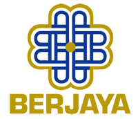
Berjaya Corporation
If you see closely this logo made up of closely interwoven B's in rich cobalt blue with gold lining around the circumference and a gold dot in the centre.
Tourism Malaysia
This logo made of blue colour word with red colour Hibiscus as our National Flower.
Blue colour also symbolizes the unity of the Malaysian people.
Genting Highlands


2 comments:
like your new template.
Thanks, actually this is copy from ur blog design because it look simple =)
Post a Comment